The new 4.0 version features a new default layout that experienced analysts have used for a long time. Here is why.
Wireshark finally has a new default layout
If you have previously visited any Wireshark training, you will know that power users have a couple of best practices when configuring Wireshark properly. Generally, these settings are beneficial for performing any analysis efficiently. By some power users in the Wireshark community, these settings are jokingly called "I don't talk to you, settings.".
Before helping novices with a particular PCAP, an experienced user should first make them aware that their settings are not optimal. It doesn't mean you can't analyze a trace file without changing them; just that it is a lot harder.
Starting with the 4.0 version of Wireshark, one of these best-practice settings is the default in Wireshark. The T-shaped layout. The release notes state:
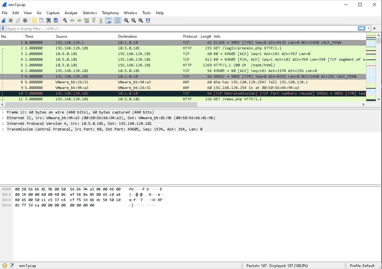
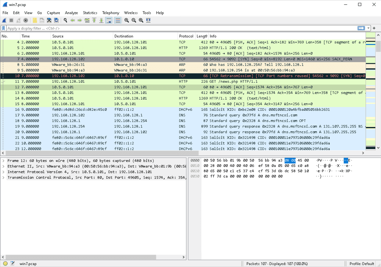
The default main window layout has been changed so that the Packet Detail and Packet Bytes are side by side underneath the Packet List pane.
Why did the developers decide to make this change? Let's find out...
Up until version 3.6 of Wireshark still has this row-based layout. Packet list, packet detail, and then packet bytes.
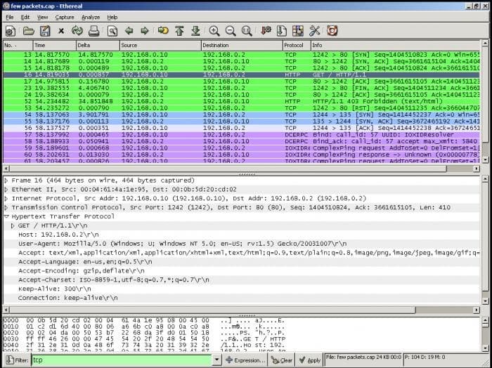
Engaging in a bit of Wireshark archeology, we can find screenshots of the predecessor of Wireshark, Ethereal, that already shipped with a row-based layout.
The new layout is T-shaped. The packet details and bytes share the space underneath the packet list.
As Roland (Wireshark core developer) says, many Wireshark power users have already preferred this layout for many years. Therefore it makes sense to change the default profile to match this.
If you want to keep the old layout, it is simple enough to change it back. Open the preferences dialog: Edit -> Preferences...
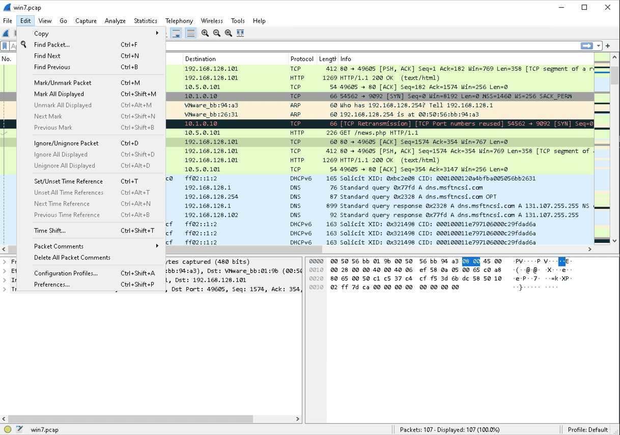
Then navigate to the layout preferences: Appearance -> Layout -> Click the desired layout -> ok.
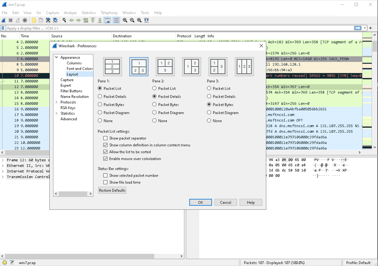
Network analysts deal with thousands or millions of packets in a typical trace file. A layout that avoids too much scrolling and clicking removes mental load from the analyst and makes it easier to concentrate on the data. The problem is apparent when looking at all the unused space in the pre-4.0 setup.
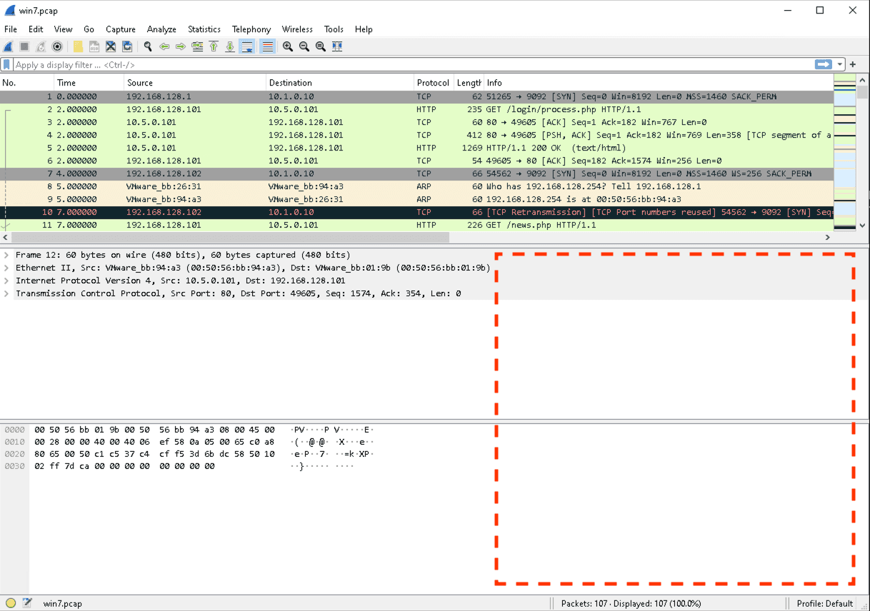
If you own a high-resolution display, you may want to change the default display layout even with 4.0.
A column-based layout allows you to see a maximum of the packet list while keeping a large part of the packet details visible. By minimizing the packet bytes, you gain even more space. The packet bytes can be helpful but not required in many analysis scenarios.
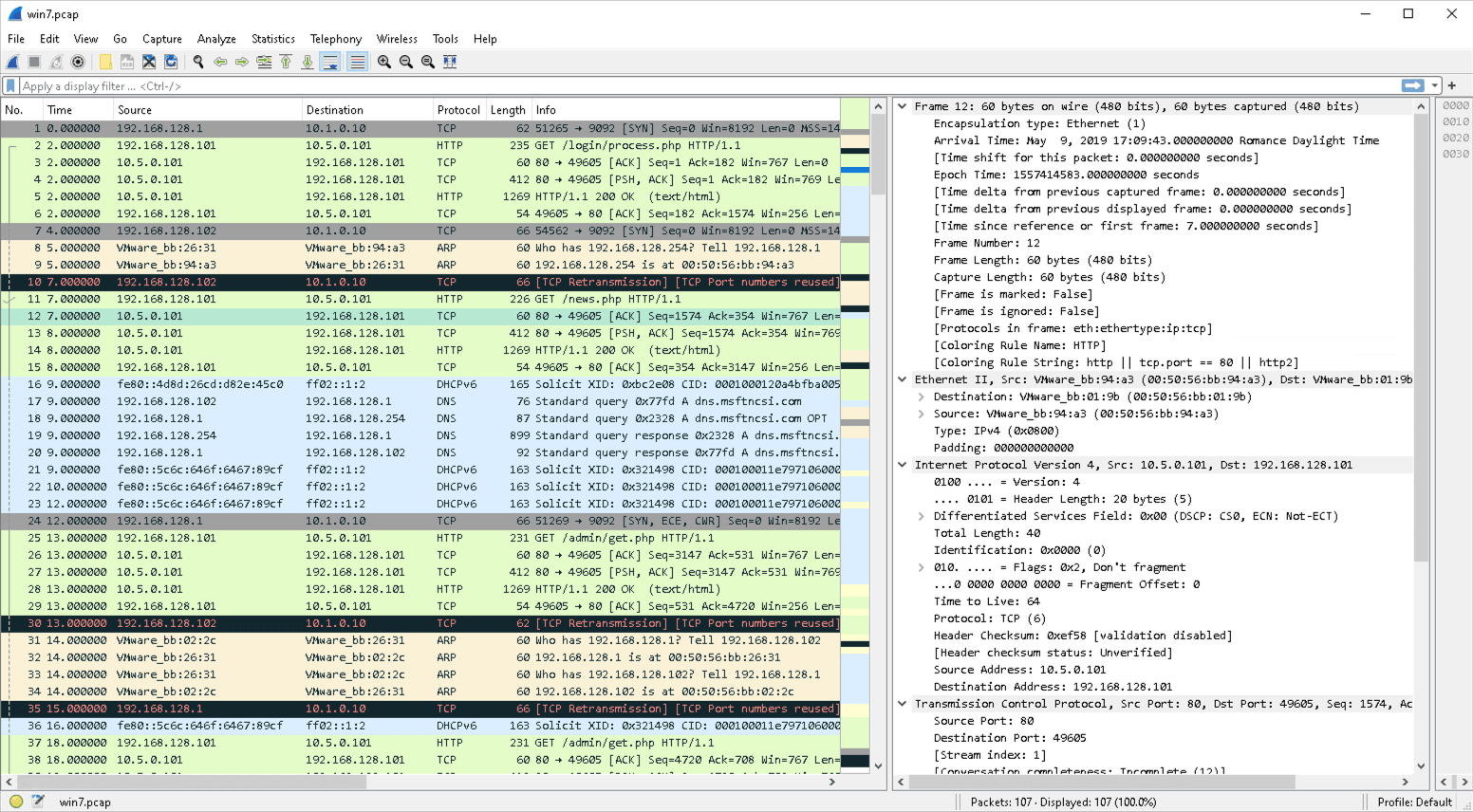
With this setup, it is much easier to concentrate on the packet analysis and avoid constantly scrolling to find the right display field in the packet details.
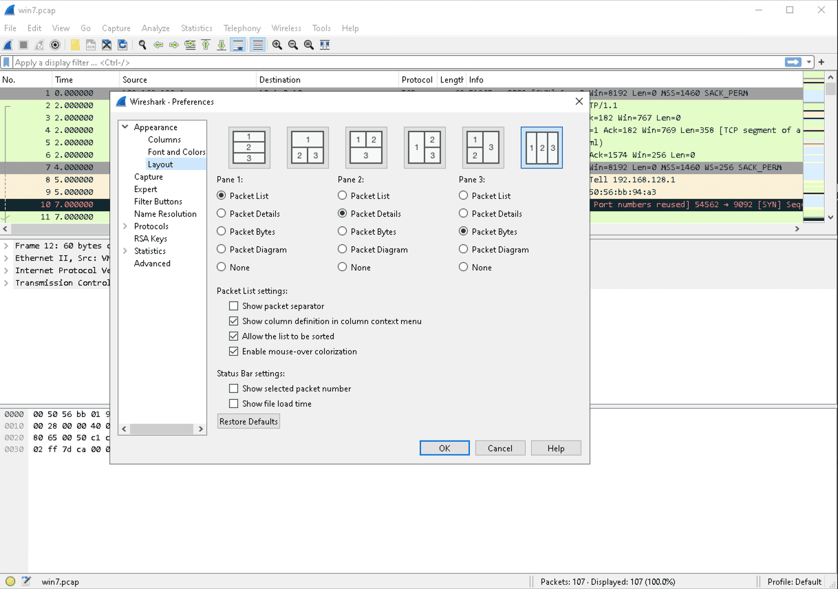
You can configure this using the last default layout in the layout dialog.
The default layout is just one of many enhancements of the new Wireshark version. Visit our training to learn the basics of Wireshark and get to exercise on real-world challenges.


