Connection view
Packet Safari quickly drills down connections of an uploaded packet trace.
Packet Safari connection view gives you many benefits:
⚡️ Better Performance. Immediately spot certain connections.
⚡️ Visual connection drill down. Dumbell plot of connections start and end times.
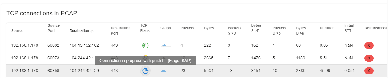
⚡️ Anomaly detection. Visual colour coding of TCP connection flags.
⚡️ Connection state tracking. Easily spot connections state by per connection visualization
⚡️ Retransmission count. Detect problematic connections using the per connection retransmission count
⚡️ Sorting. Sorting connections based on throughput, iRTT, number of packets, ports, flags
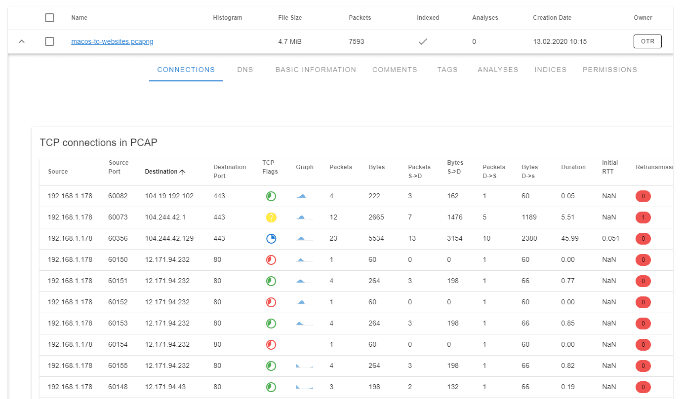
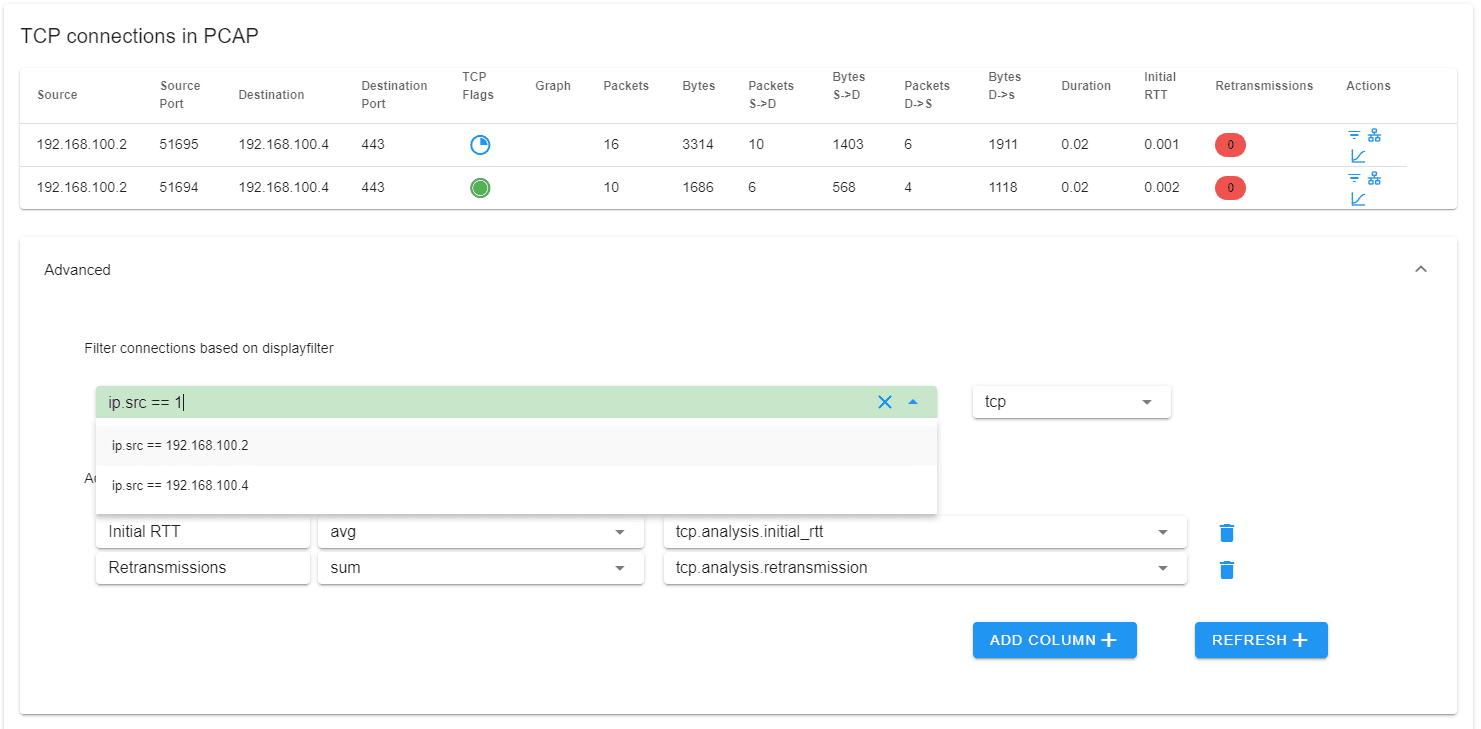
Connection table
The connection table allows you to quickly assess the health of each TCP connection
The connection table lists all the connections in the PCAP. The table is sortable by any of the headers. For each connection, a small packet histogram is generated that gives you a quick insight into when each connection is active. The TCP flags aggregate all TCP flags seen for each connection. This makes it easy to spot unfinished, half-open or reset connections.
For each connection basic performance indicators like duration and inital round trip time are displayed. The connection table is interactive, you can click on any connection to open the packet view with the correct conversation filter.
Advanced
Aggregate any field as a column in the connection table
You can aggregate any indexed field in the connection table. This makes it easy to customize your view and find interesting connections. By default tcp.analysis.retransmission is added.
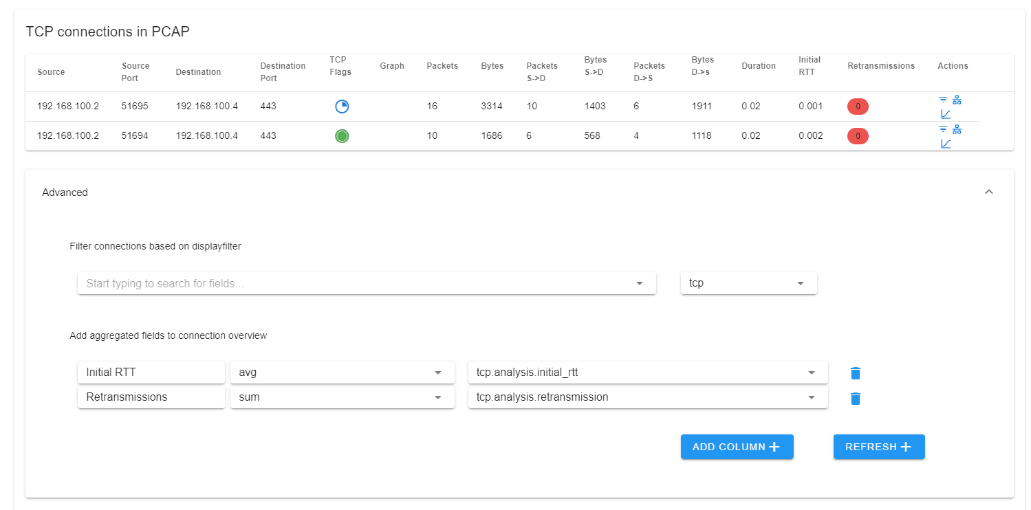
The display filter field supports auto-completion:
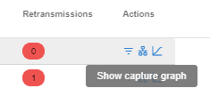
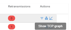
Actions
The connection table has various actions available per connection:
Conversation Filter

Capture Graph
TCP Stream Graph
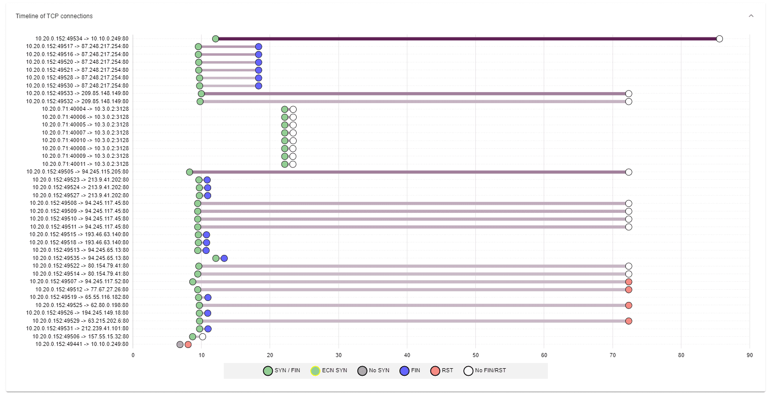
Dumbbell plot
The dumbbell plot visualizes the connections on a relative timeline. The start and end of the points have special meaning reflecting the connection flags set. Each flag combination has is reflected by the colour within the circle (explain in the legend). This makes it easy to spot unclosed connections or connections that were not completely captured within the PCAP. The darker line colour the more data was transferred over the respective connection. The dumbbell plot is interactive, you can click on any connection to directly filter for it in the packet view.
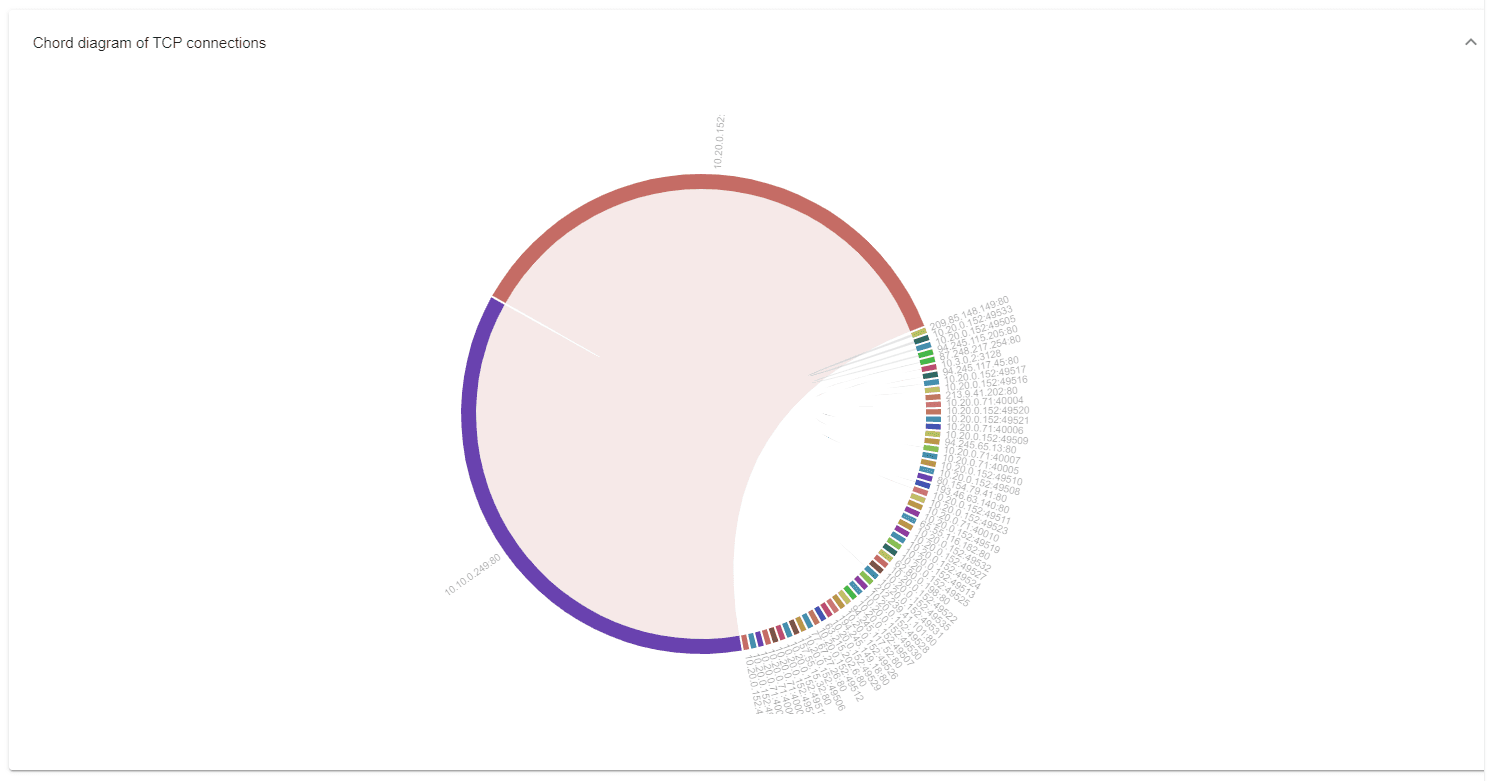
Connection chord diagrams
The connection chord diagram shows the relationship between different communication endpoints. The thinker the lines the more data was transferred between the endpoints. The chord diagram is interactive, you can click on any chord to directly apply a filter for the shown connection.
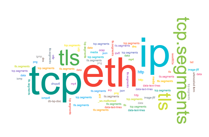
Protocol word cloud
The protocol word cloud shows which protocols are most prevalent in the PCAP. Hovering allows you to see the number of transferred bytes or packets. Clicking on a word filter for the protocol.